
A client came to us convinced their landing page needed a full redesign. New hero image, new layout, new everything.
We ran our audit first anyway.
The redesign wasn’t the problem. Their form had 11 fields for a service that should have taken three. Their meta description was a placeholder nobody had touched since launch. And their “Book Now” button was the same grey as the background text next to it visible if you knew to look for it, invisible if you were scrolling on a phone in daylight.
None of that shows up in a quick glance. All of it shows up in an audit.
This is the checklist we run on every landing page before we recommend spending a single more taka on traffic to it. It’s not exhaustive a full audit goes deeper depending on the business but it catches the issues that quietly kill conversions on page after page we review.
Start With Questions, Not the Page
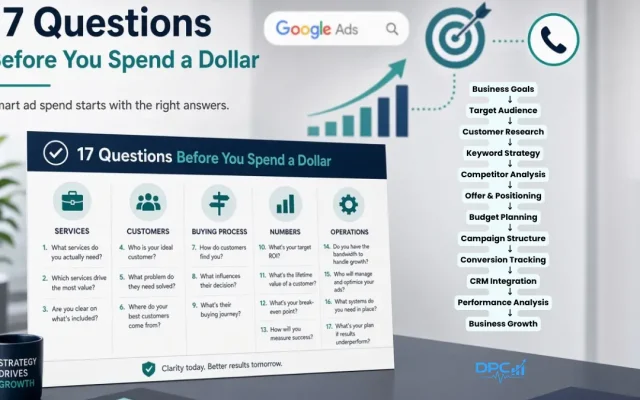
Before opening the landing page itself, we want answers to a handful of questions. Skip this step and you’re optimizing blind.
- What’s the one action you want a visitor to take?
- Where’s your traffic coming from Google Ads, Meta, organic, email? Each source arrives with different expectations
- What’s your current conversion rate, and how many days of data do you actually have behind it?
- What does your ad or post actually promise? The landing page has to deliver on that exact promise, in the same words
- What are the three objections that come up most before someone buys?
If you can’t answer these, the audit will still surface real issues but the recommendations will be guesses instead of priorities. Data first, opinions second.
Technical Foundations
A beautiful page that loads slowly or breaks on mobile never gets the chance to convert anyone.
Speed and performance. Run the page through PageSpeed Insights for both mobile and desktop. Look specifically at Largest Contentful Paint, Cumulative Layout Shift, and server response time not just the overall score, which can hide a slow-loading hero image behind a decent number elsewhere on the page.
Mobile experience. Test every breakpoint, not just one. Check that tap targets are large enough to hit with a thumb, that no element causes horizontal scroll, and that form fields trigger the right keyboard email fields should pull up the @ symbol, phone fields should pull up the number pad. Small detail, real friction if it’s missing.
Technical SEO basics. Title tag under 60 characters and actually describing the offer, not just the company name. One clear H1. Meta description that sells the click instead of just describing the page. Schema markup if you’re a local business or service provider this is free real estate in search results that most competitors skip.
The Conversion Audit
This is where most of the real money is found.
Above the Fold
Everything a visitor needs to understand your offer and take action should exist without scrolling. That means:
- A headline that states the benefit, not the feature
- A subheadline that adds one layer of specificity
- One primary call-to-action, visually distinct from everything else on the page
- A trust signal a client count, a rating, a guarantee visible immediately, not three scrolls down
Watch for competing CTAs. We see this constantly: a “Call Now” button and a “Get a Quote” button sitting side by side, both trying to be primary. Pick one action per page. If you genuinely need both, make one visually secondary an outline button next to a solid one so the visitor’s eye knows where to go first.
Forms
Every field you add past the minimum needed to follow up is a small tax on your conversion rate. Name, email or phone, and one qualifying question is often enough. If you’re gathering ten fields “just in case,” you’re trading volume for a data wishlist.
Check the submit button copy too. “Submit” tells a visitor nothing about what happens next. “Get My Free Quote” or “Book My Consultation” tells them exactly what they’re about to get.
Social Proof
Generic testimonials “Great service, highly recommend!” do almost nothing. The testimonials that move people include a name, a role, a company, and a specific number: a percentage improvement, a dollar figure, a timeframe. “Our cost per lead dropped 45% in two months” does more work than five paragraphs of general praise.
If you’re not collecting testimonials with those specifics baked in, start asking for them directly when you request a review: “What specific result are you most happy with?”
Objection Handling
Every landing page should answer the questions a visitor is quietly asking before they’ll commit. Price, trust, time commitment, and complexity are the four that show up most often across industries. An FAQ section addressing the real top five to seven objections not generic ones closes gaps a hero section can’t.
If pricing is a common objection, don’t hide it entirely. Even a range or a “starting at” figure reduces the anxiety of the unknown enough to keep someone reading instead of bouncing.
Message Match Is the Cheapest Lever You’re Not Pulling
If your ad promises “20% off your first order” and the landing page headline says nothing about a discount, you’ve already lost a portion of every click you paid for. The words, numbers, and visuals in your ad should show up again on the page, ideally in the first screen a visitor sees.
This sounds obvious written out. It’s one of the most common gaps we find in practice, especially on accounts that have run the same landing page across multiple ad campaigns with different offers and angles.
What to Actually Track
An audit without a baseline is just an opinion. Before making changes, know your starting numbers:
| Metric | Healthy Range | Worth Investigating |
|---|---|---|
| Bounce rate (paid traffic) | Under 50% | Above 70% |
| Time on page | Over 2 minutes | Under 30 seconds |
| Scroll depth | Over 75% | Under 50% |
| Form abandonment | Under 30% | Over 50% |
| Mobile vs. desktop conversion | Within 20% of each other | Mobile significantly lower |
If mobile conversion is dragging well below desktop, that’s usually not a coincidence it’s a specific, findable issue on the mobile layout, not a general “mobile underperforms” pattern to shrug at.
The Order We Actually Fix Things In
Not every issue deserves equal urgency. After an audit, we sort findings into three buckets:
Fix this week: broken or confusing forms, missing/wrong tracking, competing CTAs, anything actively costing conversions right now.
Fix this month: copy rewrites, testimonial upgrades, message match corrections, FAQ additions.
Test over time: headline variations, CTA color and copy tests, form length experiments, social proof placement. These need traffic and patience, not urgency.
Trying to fix everything simultaneously usually means nothing gets properly tested and you can’t tell which change actually moved the number.
One Page, One Goal
If there’s a single principle underneath this entire checklist, it’s this: a landing page that tries to sell, educate, and capture an email all at once usually does none of the three well. Before adding another section, another CTA, or another trust badge, ask whether it serves the one action you actually want the visitor to take and cut it if it doesn’t.
Want a second set of eyes on your landing page before your next campaign launch? We run this exact audit technical, conversion, and message match as part of our CRO and reporting work, and SEO strategy when the traffic itself needs fixing too. Get in touch and we’ll tell you what’s actually costing you conversions, not what we think would look nice.

Leave a Reply